Monday, 4 November 2013

#SewNovember Project

For November myself and a few others have decided to attempt to make things that we wouldn't normally. The concept is to challenge yourself with something new and if you finish it, to start something else. This is to coincide with the premise of nanowrimo which takes place in November. Therefore sewing & blogging as I'm not a writer haha! 
My project will be a little adventurous as I'll be making a sofa cover out of remnants & fabric I've obtained from a previous job. To that end there is a massive amount to do and sadly the first post isn't overly exciting. ALL the unpicking! Essentially I have to unpick the old cover to get the pattern, then draft it, cut it put then sew. This will take a while... So here's a little shot of some of the work so far! More tomorrow! 


Wednesday, 28 August 2013

Ayacon 2013 cosplays revealed!

Last post referred to the cosplays was going to undertake for Ayacon 2013. Needless to say they are below!

I'm really happy with how both came out, more so because of the reception they got as well! I have some very talented friends with cameras so go check out more pictures on my deviantart and cosplayisland accounts (linked on this page) for more! But here are two pics that were pretty boss that I thought needed popping up! Enjoy!

For context they're HIM from teh Powerpuff girls which was worn at the Cosplay Chess event on the sunday and Dah'Yis from Final Fantasy Crystal Chronicles, worn for the masquerade and photo shoot on the saturday!

PS New project starting soon so look out for reg updates on here on cosplay progress!


Tuesday, 2 July 2013

Still alive!

Apologies! Not dead, still here! Just had a lot of work to do recently. However with the big summer cons looming I'm about to embark on my next 2 cosplays. Keep a look out for more!

Cheers!

Tuesday, 28 May 2013

COSPLAY SHIZZ!

So I thought SCREW IT! DOUBLE POST! This time its a cosplay post (if you couldn't guess from the title)

With Ayacon about 3 months away I thought I'd post a little bit of what i've done already this year... Yeah not a lot!

I say that I've managed to pull off a few small and relatively inexpensive cosplays that actually proved to be pretty fun! So first up is what I wore to Midlands expo all the way back in February. This was a 2 parter as the cosplay was to go with a few friends in Code Geass cosplay group for Minami Con later in March.

Hardest part of this cosplay? The separate double breast piece that literally floats atop the jacket. Needless to say with some seam wizardry I managed to top stitch it down with the machine using the biased edge as an anchor point. Then I turned the bias binding by hand-stitching it to get the clean look. I love blind bias binding! SO CLEAN!

The buttons were a nice little find from an old coat I had knocking around and suitably harvested & the insignia on the neck were simply appliqued on using the time and tested method of tracing PVA glue over the sketched image I had & then cut out and attach using a little more of the sticky white stuff ;)
PRO TIP: Do this PVA method on your applique before you cut out to stop from any fraying. Be careful though and always test it out on your fabric sample first!
The outfit was made using cotton bias, polycotton black for breath-ability and a little bit of drill for weight on the belt.

Next up is the Other cosplay I made for Minami con in March, again to go with a friend's cosplay. This time it was Kamille Bidan from Gundam Zeta in his casual clothes you see in a I think episode 18 or 19. The top was made from a cotton jersey and the sleeves were hemmed at the cuff with elastic to follow the reference images.
The top needed a slightly 70s/80s feel to it so I made it slightly larger then it should be and used the cotton jersey to add a little float to achieve the overall look. Green wig in tow (noticeably no need for styling save for a little brushing and hairspray for hold) I was ready to be Bright & Sheen slapped!

Also this proved a challenge as the neckline had to be rolled. I've only ever made one other roll necked top and that used stretch material. The jersey had a little to it but not much so it was a little bit of a fight to get it to do what I wanted and not end up with a snood. The pic to the left only shows the garment WIP. The sleeves and bottom have yet to be hemmed inserted with elastic. Overall a SUPER comfy top!

Okay more cosplay to come next time but for now go check out minami con and MCM Midlands expo websites for more info on each (can't find them? GOOGLE!)

Global Traveler Pt 2 (and other things!)

So from where we last left off I'd gone through the building process. This post will be predominantly be about the styling of my 5 mannies and some of the tweaks I've made to it since.

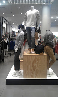
Given the current trends of chinos and brights in menswear I decided to give one last shout to the declining denim trend. While denim is still a strong look (when worn correctly that is- even double denim*) it has started to thankfully give way to some different trends that arguably can enhance the odd key piece which my styling aimed to emphasise. Denim in small doses.

So moving swiftly on I had decided to use a mixture of shades and textures ranging from dark wash with emphasised seams to more stone-washed and relaxed styles in both bottoms and shorts. Denim colours also featured, as when used on differently textured fabrics they can provide a bit more depth to an outfit and break up the hardness of the denim fabric itself.


The first of a 5 I styled was a no brainer. I decided to go with a great pair of denim shorts & a checked shirt (tucked with a belt to retain a cleaner silhouette). Finishing the outfit was a trim pair of tan boat shoes and rolling the sleeves of the shirt to highlight the white tee underneath. This broke up the overpowering colour of the shirt and drew attention away to accessories such as the blue & red belt, used to bridge the colour gap between the shorts and shirt. This overall came out as a really lovely preppy but kind of casual outfit for a summer afternoon out.

Next mannequin was dressed in a dark denim shirt and rust coloured chino. Sadly the pic doesn't give the embellished seams that were a big factor in choosing the bottom half of the outfit. As the seams were a gold-ish colour going one metal tone to accompany it was in my mind the right choice as the outfit was kept warm as darker denim can be overpowering. Pro tip for dark denim- autumnal colours like browns, rusts & oranges tend to work well as they don't over power the harshness of the denim.

Lastly I made a somewhat fashion Faux Pas. I double denimed. Not so much in material but in tone. The mannequin up top was dressed in a pair of denim shorts with a lavender tee underneath to give a little bit of tonal freshness then topped with a Linen denim coloured jacket. This to me attended to the main rule of double denim. If you're going to do it, use different tones that offset each other. Never try to mix and match as you'll only look like a poor 80's throw back (unless y'know that's what you want). Finally adding in the travel bag was a key choice, as the accessory breaks up the colours of the outfit but also adds a more stylish element as accessories like this have become a key feature for the more fashion conscious man.


I'm going to stop here for now as I'm aware this is going to be a long post if I keep up this up. For now have a nose at these pics of another window I was doing at the time which is to coincide with the theme of white. It was a quick installation that required me to use linens, laces and suitable home product to tie in. The result I'm told is probably one of the best i've done. So I'm a little chuffed with this one! Enjoy!


In the pics are some wicked little bits and pieces (notably the jar of pegs & ice cream cone pen from Paperchase)

Love this window set, and am going to get some pics of it before It is disassembled giving way to father's day.

Sunday, 19 May 2013

Global Traveler site Pt 1

So recently at work I've been allowed to have my own project on the men's floor to spruce up the place visually.
So I decided on making a 5 mannequin grouping a little more imaginative then the current setup:

Needless to say the current theme... not so interesting huh?

So in an attempt to jazz it up a bit I went about getting some ideas down and making a presentation to the dept store manager (nervous as hell!), of which she thankfully approved of, and setting in motion what I wanted to achieve.

So what did I want to do???

I wanted something long lasting, interesting and visually exciting. Something intrinsically men's oriented. In the end I stopped on travel and exploration. There are few things that set a guys imagination going then exploring and a feature of that is a good old fashioned map!

Using one of 2 large wooden bags we retain for in-store displays as a base I covered it in backing paper, then went about attaching pre-stained (with tea & coffee for the primary school vintage look- so pro!) maps from various atlases & fold outs using double sided sticky tape.


From there it was an afternoon of arranging, moving and shaping the overall layout of the maps, all of which overlapped like an explorers desk, to give a less uniform but still maintained look.

Next 5 mannequins were arranged around and on top of the feature prop, with wooden crates to provide interest points for small stock displays. This in turn provided ample opportunity to duel display stock otherwise unseen as accessories are usually the first thing on a guy's list of things to buy.


The photos included are only a couple of the overall I took of the building and making process. The rest will be posted on my deviant art page which is link on the left hand toolbar (if not search neo-mogorx).

The next post will be on the styling and a few more little bits about eh making process ending in a review of the piece. If you have any questions please don't hesitate to ask and get in touch! Always like some constructive criticism!

Thanks for the quick read, look out for part 2!!!

Tuesday, 7 May 2013

So tomorrow Ii'll be starting my own in-store visual site on the men's department. I had the confirmation and approval today after a 15-20 minute interview outlining the processes involved, cost/budget & the sustainability of the site itself.
An evening's worth of work was well spent!

From building and placement, to styling and completion I'll be documenting the entire process. Hopefully giving some of you guys a few Ideas of your own!
Check back friday for more!